Monday, April 23, 2007

THE PUNK ROCK MOVEMENT

The term “punk” has many different meanings associated with it. There are some common aspects of punk and punk art, however there are many subdivisions, each with their own agendas which spans roughly from the 1970's to today. Punk is inspired by a variety of non-literary aesthetic forms that became popular in the late 1960s and throughout the 1970s, such as punk rock music, hardcore pornography and exploitation films, and graphically violent/sexual visual art (such as R. Crumb's work in Zap Comix).

In 1975 punk first emerged from New York's Greenwich village and surfaced at the small bar in the Bowery called CBGB's. Many bands, such as the Talking Heads, the Ramones and Blondie, emerged who were disillusioned with mainstream music, each with their own unique sound, although there was a clear united theme of rebellion and subversion.

In New York, punk rock might have signified a rebirth of rock and roll, but in London an entire culture was conceived. Here the social climate was one of poverty and frustration. Unemployment soared to record levels while the economy plummeted into the deepest depression since World War II fueling the uneasiness of the younger generation. In addition to economic despair, increasing division between the upper and lower class people outraged many sparking violence throughout the country.

Punk rock offered an escape from the hopeless conditions of late 1970's London, while simultaneously empowering the thousands of young people who had been marginalized by a culture in turmoil. The art that emerged was usually in the form of album art, posters, and graffiti that confronted a range of social issues, like racism, oppression, and class conflict while other art promoted empty rebellion and nihilistic views.

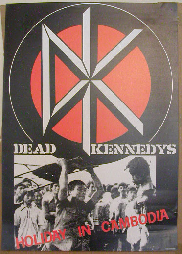
Punk rock is also known for an affiliation with radical, neo-Marxist politics. The Dead Kennedys, along with lead singer Jello Biafra's label Alternative Tentacles, gave rise to a cultural fascination with "DiY" (Do-it-Yourself) art production. DiY 'zine literature was an outlet for young people to share and communicate their subversive art and frustrations with society. Bands like The Dead Kennedys preached anti-capitalism by trying to call attention to the ugliness of a commodified culture, and the beauty of authentically marginal taste preferences. They did this not only through their song lyrics, but by the artwork and themes of their albums and reflected especially in their posters and small underground 'zines.

One band definitely worth mentioning is CRASS. Besides being a collection of great music Crass Records Label produced albums that were characterized by DiY artwork, photocopied sleeves which doubled as anarchist propaganda, and a unique cataloging system which involved a countdown to 1984, a year of symbolic significance because of its Orwellian origins. Their cover art which was a highly collaborative endevour included paintings, slogans and collage. (See directly below.)


Its hard to concisely explain punk art because there is such a range of bands and things that were happening throughout these decades. Punk art was largely produced by the use of copying machines which allowed for cheap mass production of gig posters and 'zines. Techniques such as photomontage, collage, and hand type were used to create these very ephemeral pieces of work.


Monday, April 9, 2007

POP ART


Left: Just What Is It that Makes Today's Homes So Different, So Appealing? (1956)
Richard Hamilton (British Pop Art)
Right: Campbell Soup Can (1960s) Andy Warhol (American Pop Art)

★ Although Pop Art has often been regarded as an American phenomenon, it was first introduced in print in 1958 by the English critic Lawrence Alloway, but for a somewhat different context that its subsequent use. During the 1950s, the Independent Group, including Alloway and other designer artists, met at in London for a discussion focused around popular (thus, Pop) culture and its implications -such entities as Western movies, science fiction, billboards, and machines. In short, they focused on aspects of temporary mass culture and were centered on its current manifestations in the U.S. (Arnason 478)

★ After a period of postwar austerity, fifties Britain began to experience new levels of prosperity that created a mass market for consumer and cultural products. American popular culture was embraced as a liberating force by a new generation who had little time for restricting exclusivity of "high culture," a notion that included not only aristocratic classicism but also the pleasures of modernist abstraction. (Arnason 479)

☆Few British Pop Artists☆
Richard Hamilton
David Hockney
Eduardo Paolozzi, sculptor

☆Few American Pop Artists☆
Jasper Johns
Roy Lichtenstein
Andy Warhol

Resource: H.H Arnason History of Modern Art (5th Edition)

Next: じゃぱにーず・ぽっぷあーと(Japanese Pop Art)

Sunday, April 1, 2007

Postmodernism


I did some research and found no one solid explanation that was coherent. So I found an interesting and somewhat organized overall explanation in the Megg’s History of Graphic Design book.

Postmodernism is defined as beginning around 1970 as the Modern era was coming to a close. Everything that was thought to be during the Modern period began to be questioned such as cultural norms and authority of traditional institutions. Issues like the equality between men and women fueled some of the artwork created, as did minorities contributing to our societies growing cultural diversity. Accepted social, economic and environmental viewpoints were challenged and thought to be irrelevant to the emerging postindustrial society. The term postmodernism represented a culture shift that included artists, architects, economists, feminists and even theologians.

The style of architecture during Postmodernism is also a deliberate opposite to the formalism abundant in the Modernist architecture. Postmodern architecture is laden with interesting lines and curves, and sometimes includes elaborate ornamentation, which is all an attempt to mirror the postmodern desire to focus on the surface of things. Formulaic design was no longer so sought after and a more exuberant architectural style began to sweep over cities.

•Barbara Kruger is an example of a postmodern artist; her magazine cutout-like pieces speak for issues of the self and identity. Kruger worked for a fashion magazine, and her art pieces incorporate appropriated media images with strong, pithy phrases that often relate to objectification of women and other cultural issues that women face.

•Postmodern architecture relies on a uniquely represented exterior, often carrying over onto the interior of the building, because of the desire to create an aesthetically pleasing surface which was such a repetitious Postmodernist value. Some elements commonly found in postmodern architecture include irony and surprise, contradiction, and self-mockery, and definitely an element of originality.
Michael Graves is a popular postmodern architect who created many very original buildings; two of his well known designs are the Portland Building in Portland, Oregon, and the Humana Building in Louisville, Kentucky.

•Installation art pieces are also prevalent in the postmodern art world. Jenny Holzer’s installation art displays textual messages she calls “truisms,” short phrases similar to Kruger’s work, with channels often used by the media such as billboards or LED signs. Holzer’s work, much like all installation pieces, is conceptual and doesn’t require much craftsmanship; installation artists typically use manufactured or found objects, which is a popular Postmodernist feature.

(www.wsu.edu/~lauren_clark/pomoarchitecture.html)

Monday, March 19, 2007

Art Deco

Remember this, art deco started out to be purely decorative!

Now with that being said, art deco didn't have any sort of philosophical or politcal roots. It was just eye candy, it was basically a combination of various styles such as Constructivism , Cubism, Modernism, Bauhaus, Art Nouveau, and Futurism. It reached it's peak around the 1920's - 1930's when it was seen as elegant, modern and functional.

It was widely considered to be an eclectic form of elegant and stylish modernism, being influenced by a variety of sources. Among them were the "primitive" arts of Africa, Egypt, or Aztec Mexico, as well as Machine Age or streamline technology such as modern aviation, electric lighting, the radio, and the skyscraper. These design influences were expressed in fractionated, crystalline, faceted forms of decorative Cubism and Futurism, in Fauvism's palette. Other popular themes in art deco were trapezoidal, zigzagged, geometric, and jumbled shapes, which can be seen in many early pieces.

Corresponding to these influences, Art Deco is characterized by use of materials such as aluminium, stainless steel, lacquer, inlaid wood, sharkskin (shagreen), and zebraskin. The bold use of stepped forms, and sweeping curves (unlike the sinuous, natural curves of the Art Nouveau), chevron patterns, and the sunburst motif are typical of Art Deco. Some of these motifs were ubiquitous — for example, sunburst motifs were used in such varied contexts as ladies' shoes, radiator grilles, the auditorium of the Radio City Music Hall, and the spire of the Chrysler Building.
Art Deco started slowly declining and losing it's popularity when it was mass produced, people started seeing it as a false image of luxury. It has made short come back every so ofter, but for the most part this style has died out. Just a fun fact, South Beach in Miami, Florida has the
largest collection of Art Deco architecture remaining in North America, i will try to post up some picutures i took of the buildings while i'm down here.

Great examples of art deco in modern times...i use to watch Batman: The Animated Series when i was younger and i was always fasinated by the buildings of gotham city. Now i know where their inspiration came from...


Friday, March 9, 2007

6@30 featuring Clara Fialho

Saci (2007)
Where's Saci?
Columbus (2006)
Photographs by Clara Fialho

I recently went to the opening reception of 6@30, an exhibition featuring paintings by Clara Fialho and other Queens based artists. Clara’s paintings reminded me of carnivals…playful, organic, yet mysterious and spiritual. I especially loved Saci (2007) named after her original character Saci (Sah-See) who is hidden in the composition. This “Where’s Waldo?” inspired theme is evident in many of Clara’s paintings. She frequently paints in the kitchen of her apartment. Check out her work at www.clarafialho.com

Wednesday, March 7, 2007

SWISS DESIGN - International Typographic Style


In the 1950s a new graphic design style emerged in Switzerland that by the 70’s, would become the predominant graphic style in the world.
Because of it’s strong reliance on typographic elements, it came to be known as the International Typographic Style.

The style was defined by 3 things;

- the use of a mathematical grid to provide an overall orderly and unified structure

- sans serif typefaces (especially Helvetica, introduced in 1961) in a flush left and ragged right format

- a preference for black and white photography instead of drawn illustrations

The overall impression was one of simplicity and rationality. It was generally tightly structured and clear and harmonious at the same time. The emphasis was on cleanliness, readability and objectivity.

The style was essentially developed at two design schools in Switzerland, one in Basel led by Armin Hofmann and Emil Ruder, and the other in Zurich under the leadership of Joseph Muller-Brockmann. All had studied with Ernst Keller at the Zurich School of Design before WWII, where the principles of the Bauhaus and Jan Tschichold’s New Typography were taught. In 1918, Ernst Keller, of the Zurich School of Arts and Crafts, created a model that would become the core of the Swiss School's experiments. Characterized by a rigid grid system, structured layout, and unjustified type, Keller's approach determined the essential tenets of contemporary typography.

The new style became widely synonymous with the "look" of many Swiss cultural institutions which used posters as advertising vehicles. Hofmann’s series for the Basel State Theater and Muller-Brockmann’s for Zurich’s Tonhalle are two of the most famous. Hofmann’s accentuation of contrasts between various design elements and Muller-Brockmann’s exploration of rhythm and tempo in visual form are high notes in the evolution of the style.

Emerging from the sensibilities of New Typography, Bauhaus, and De Stijl, the Swiss Style realized such success in large part because of the Swiss government. There was an increasingly global postwar marketplace; corporations needed international identification, and global events such as the Olympics called for universal solutions which the Typographic Style could provide. With such good teachers and proselytizers, the use of the International Typographic Style spread rapidly throughout the world.

Saturday, March 3, 2007

Design Life Now - Greg Lynn FORM


I enjoyed the exhibition a lot as I found it informative and ‘aesthetically pleasing’ as well as entertaining. I had also never been to the Cooper-Hewitt Museum before which I thought was beautiful and a great space to display the Design Life Now exhibition.

However, I think as far as layout goes, the exhibition wasn’t put together in a very effective way – there was no real order or any kind of sequence. I felt like everything was just displayed anywhere and everywhere with no real thought or logic put into it. The content of the exhibition is quite random – there is a huge variety of what’s on show so in some ways I can see why the layout reflects the randomness and diversity of all the pieces.

The designer’s work that caught my eye the most was Greg Lynn’s ‘Form’.
In 2003 the Italian company Alessi presented and released the exclusive Tea & Coffee Towers designed by 22 international architects. In 2004 they commissioned the same 22 architects to design a simple, porcelain mocha cup to be commercially produced and sold.
Greg Lynn designed the cups with two things in mind; to allow for numerous cups to ‘fit’ into each other for practical storage and also for the shape of the cup to conform to a comfortable shape in one’s hand. As well as having what I think is a very unique design, the cups are also practical.
Lynn’s Alessi flatware and grill are still in the prototype stage. The flatware, which is due to be launched later this year, has a very strong Art Noveau influence, with the shape of each utensil suggesting a stem, leaf, or flower. I love the free-flowing lines and feminine, organic shapes.
Greg Lynn is primarily an architect and I think his products reflect this. I think his products are innovative, original and have a definite architectural quality about them.
You can check out this website to see more of Greg Lynn's work;
www.glform.com